<< Hide Menu
1.2 Opportunity Cost and the Production Possibilities Curve (PPC)
5 min read•june 18, 2024
Jeanne Stansak
Isabela Padilha
Jeanne Stansak
Isabela Padilha
Introduction to the Production Possibilities Curve (PPC)
The production possibilities curve is the first graph that we study in microeconomics. 📈 It shows us all of the possible production combinations of goods, given a fixed amount of resources. In eceonomic analysis we have to develop assumptions to be able to draw conclusions. For the Production possibilities curve we assume three things when we are working with these graphs:
- Only two goods can be produced
- Resources are fixed
- Technology is fixed
The production possibilities curve can illustrate several economic concepts including:
Efficiency
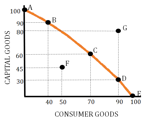
- Allocative Efficiency - This efficiency means we are producing at the point that society desires. This is represented by a point on the production possibilities curve that meets the desires and needs of a particular society. If you are given the situation where a particular society needs about an equal amount of sugar and wheat then the allocative efficient point would be C.
- Productive Efficiency - This efficiency means we are producing at a combination that minimizes costs. This is represented by any point on the production possibilities curve. In the below graph this is represented by points A, B, C, D, and E.
- Point F in the graph below represents an inefficient use of resources. You can produce at this point, but you are not using all your resources as efficiently as possible.
- Point G represents a production level that is unattainable. At this point, you do not have the needed amounts of resources to produce the number of goods shown.
- Any point below point F is considered extreme inefficiency and could be an indicator of a severe recession.
Scarcity
Since scarcity is a situation where there are limited resources versus unlimited wants, a production possibilities curve is used to show how we produce goods and services under this condition. This is shown in the graph above by showing how, given a fixed set of resources, we can produce either combination A, B, C, D, or E.
Opportunity Cost/Per-Unit Opportunity Cost
This is the value of the next best alternative. We represent this as what we are losing when we change our production combination. For example, moving from A to B on the graph above has an opportunity cost of 10 units of sugar. Per-unit opportunity cost is determined by dividing what you are giving up by what you are gaining. So for the graph above, the per-unit opportunity cost when moving from point A to point B is 1/4 unit of sugar (10 sugar / 40 wheat). Opportunity Cost can also be determined using a production possibilities table:

The opportunity cost of moving from point C to D is 40 tons of oranges. The per-unit opportunity cost of moving from point C to point D is 1/2 ton of oranges (40 tons of oranges/80 tons of pears).
Formulas to Calculate Opportunity Cost
- The opportunity cost for GOOD X = Δ Good Y Production/Δ Good X Production
- The opportunity cost for GOOD X = Time to Make 1 Unit of GOOD X/Time to Make 1 Unit of GOOD Y
Economic Growth
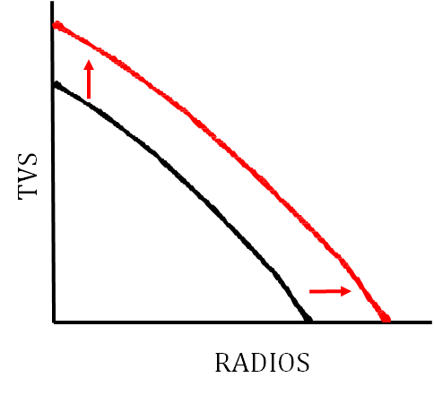
Economic growth is shown by a shift to the right of the production possibilities curve.
If a country produces more capital goods than consumer goods, the country will have greater economic growth in the future. If the country illustrated below produces at point B, they will see more economic growth than if they produce at point D. Since capital goods are tools and machinery, the increased production of them will lead to more production of consumer goods in the future, causing more economic growth.
Economic Contraction
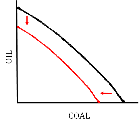
Economic contraction is shown by a leftward shift of the production possibilities curve.
Constant Opportunity Cost vs. Increasing Opportunity Cost
The production possibilities curve can illustrate two types of opportunity costs. Increasing opportunity costs occurs when you produce more and more of one good and you give up more and more of another good. This occurs when resources are less adaptable when moving from the production of one good to the production of another good. Constant opportunity cost occurs when the opportunity cost stays the same as you increase your production of one good. This indicates that the resources are easily adaptable from the production of one good to the production of another good.
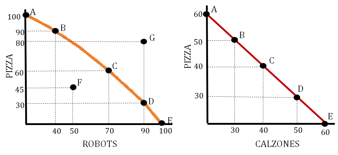
The graph on the left shows increasing opportunity cost and the graph on the right shows constant opportunity cost. The graph on the left shows increasing opportunity cost because as you move from point A to B you give up 10 pizzas but as you move from point B to C you give up 30 pizzas. The graph on the right shows constant opportunity costs because when you move from point A to point B you give up 10 pizzas and when you move from point B to point C you give up 10 pizzas.
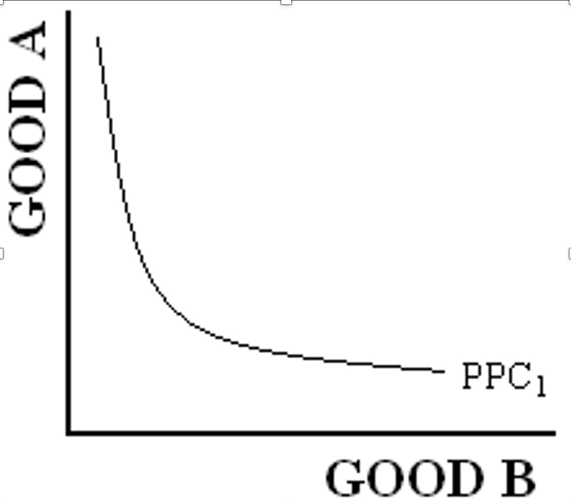
There is a nother type of graph which is the decreasing opportunity cost curve that is not possible in real life. This is what the graph looks like:
Shifters of the Production Possibilities Curve (PPC)
There are several factors that can cause the production possibilities curve to shift. These factors include:
-
Change in the quantity or quality of resources 🌍
-
Change in technology 💻
-
Trade 🔁
The production possibilities curve can show how these changes affect it as well as illustrate a change in productive efficiency and inefficiency.
Here are some scenarios that illustrate these shifters:
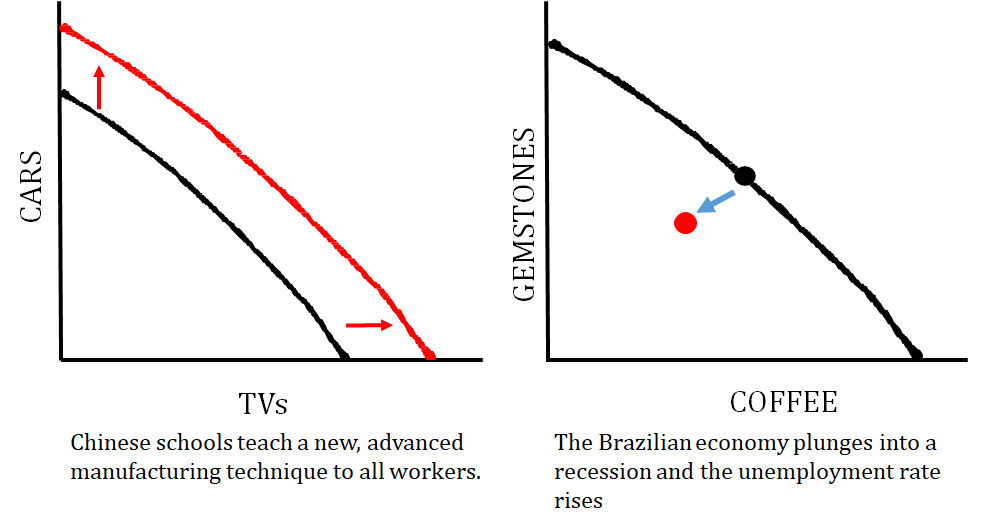
The graph on the left shows how an improvement in the quality of resources impacts the graph. The graph on the right shows what happens when a country is producing at an inefficient point.
The graph on the left shows a technology change that just impacts one good that a country produces, and the graph on the right shows what happens when the quantity of resources changes (i.e. number of workers decrease).

© 2024 Fiveable Inc. All rights reserved.