<< Hide Menu
1.4 Representing a Categorical Variable with Graphs
6 min read•june 18, 2024
Jed Quiaoit
Lusine Ghazaryan
Jed Quiaoit
Lusine Ghazaryan
You might recall from earlier that categorical variables can be represented using tables and/or graphs. This section will provide more context that'll equip us with the ability to eventually construct and describe numerical or graphical representations of data distributions. 👍
As for why graphs are big in statistics, graphical representations and statistics are powerful tools for understanding and summarizing data. Graphs can help you visualize the patterns and relationships in your data, and statistics can help you quantify and describe those patterns. By using both graphical representations and statistics, you can gain a deeper understanding of your data and communicate that understanding to others!
Bar Graphs
Bar charts (or bar graphs) are used to display frequencies (counts) or relative frequencies (proportions) for categorical data. The height or length of each bar in a bar graph corresponds to either the number or proportion of observations falling within
each category. 📊
To create a bar graph, you first need to decide on the categories you want to include. Each category corresponds to a separate bar on the graph. The height of each bar represents the frequency or count of observations in that category. All the bars have the same width, and there is a gap between adjacent bars to distinguish them from each other. 📏
When translated into a step-by-step procedure, here's how we would create a bar graph:
- Determine the categories you want to include in the graph.
- Count the number of observations in each category.
- Mark the frequencies on the vertical axis and the categories on the horizontal axis.
- Draw the bars, with the height of each bar representing the frequency of the corresponding category.
- Add a title and axis labels to the graph to help interpret the data. It's important to choose an appropriate and consistent scale for the vertical axis. You should also consider adding a legend to the graph if you have multiple series of data that you want to compare.
To keep it short, here is the bar graph of stress on the job. We can also use relative frequencies or percentages to construct the bar graph. You can be creative and color each category with a different color. It will be visually attractive and easier to compare them.
Source: Prem S. Mann: Introductory Statistics. John Wiley and Sons Inc. 2020
Pie Charts
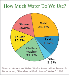
A pie chart is a circular graph that is divided into slices, with each slice representing a different category. The size of each slice is proportional to the fraction of the whole that is represented by that category. Pie charts are often used to show the relative proportions of different categories within a dataset. 🥧

To create a pie chart, you'll have to keep the following steps in mind:
- Determine the categories you want to include in the pie chart. (Example: Commuter, non-commuter)
- Calculate the fraction of the whole that is represented by each category (Example: Out of 50 respondents, 30 commuters would occupy 3/5ths of the pie, while 20 non-commuters would occupy the remaining 2/5ths of the pie).
- Draw a circle and divide it into slices that are proportional to the fractions calculated in step 2.
- Label each slice with the corresponding category and the percentage it represents.
- Add a title to the pie chart to help interpret the data. It's important to keep in mind that pie charts are best used to compare the relative proportions (percentages and relative frequencies, for example) of different categories. They're not as effective at showing precise values or small differences between categories. If you want to show detailed values or compare the values of multiple categories, it is usually better to use a different type of graph, such as a bar chart.
💡 Tips:
- The choice between bar graphs and pie charts will depend on how many categories that variable of your interest assumes and the size of it. Whenever you have many categories or few categories with about the same frequencies, then the bar graph should be your first choice. If the pie has many slices or slices of the same size, it will be hard to compare the groups.
- Be careful of quantity distortions and keeping the area principle.
Contingency Table (Two-Way Table)
Now that we know how to represent data in tables and charts, let's add one more character to the tables gang to keep things evenly balanced!
A contingency table is a type of table that is used to organize and (later on) analyze categorical data. It shows how the observations in a dataset are distributed among different categories of two or more variables. Contingency tables can help in understanding relationships between variables and identifying patterns or trends in the data. 🎨
To create a contingency table, you'll have to:
- Determine the variables you want to include in the table.
- Count the number of observations in each category of each variable.
- Organize the counts in a table, with each row representing a category of one variable and each column representing a category of the other variable.
- Add row and column totals to the table. (This step is the easiest to forget!)
- Analyze the table to identify any patterns or trends in the data. (This is important when establishing context and responding to Multiple Choice and Free Response Questions in the AP exam!) If the numbers in the cells of the contingency table are the same for all categories, we can say that the variables are independent, If the numbers in the cells are different for different categories (with some having higher values than others), then the variables might be related. For example, if you are analyzing data on the relationship between gender and income, you might find that the proportions of men and women in different income categories are different, indicating some sort of relationship between the two variables.
🎥 Watch: AP Stats - Analyzing Categorical Data
Key Vocabulary
- Frequency Table
- Relative Frequency Table
- Pie Chart
- Bar Graph
- Two-way Table
Real-Life Applications: To Trust or Not To Trust a Bar/Pie Chart?
Chances are, you've probably seen a bar or pie chart in some shape or form before in the news, media you consume, or even other textbooks. It's important to remember that they shouldn't be taken immediately at face value as they could be easily misused. To help inform whether bar/pie charts are reliable or not, here are examples of ways they are commonly misused:
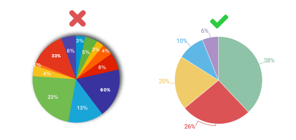
- Using bar/pie charts to compare variables on different scales: Charts are best used to compare categories or groups that are on the same scale. If you are comparing variables that are on different scales, it can be difficult to accurately compare the sizes of the bars/pie slices.

Source: Infogram
- Using bar/pie charts to show continuous data: Charts are best used to show categorical data, not continuous data. If you have continuous data, it is usually better to use a different type of graph, such as a line graph or scatterplot.
- Using bar/pie charts to show small differences: Charts are not very effective at showing small differences between categories. If the differences between the categories are small, it may be difficult to accurately interpret the graph.
- Using bar/pie charts to show trends over time: Charts are not well suited for showing trends over time. For this purpose, it is usually better to use a line graph or a time series plot.
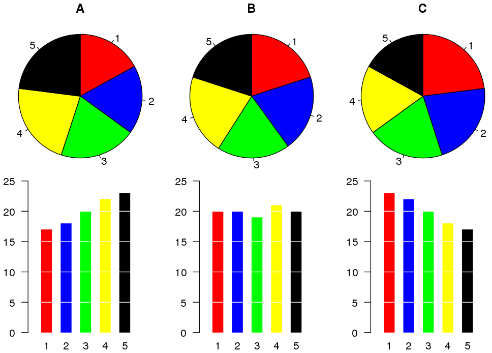
- Using bar/pie charts to show more than two variables: Charts are typically used to compare two variables. If you want to show more than two variables, it is usually better to use a different type of graph. The example below compares A, B, and C; here, you can see that it might make more sense to use a bar chart over a pie chart.

Source: Wikipedia
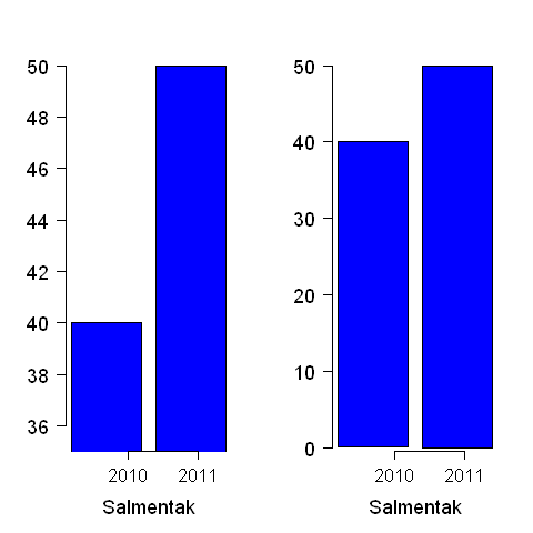
- Using bar/pie charts to show a false impression of size: Truncated bar graphs (bar graphs that don't start at a y-value of 0) can be misleading if the truncation is not clearly labeled or if the truncation is done in a way that distorts the data. For example, if the truncation is done at an arbitrary value, it could give the impression that the data is more evenly distributed than it really is. See the example below and notice how the differences between 2010 and 2011 are more noticeable in a truncated bar graph (left) compared to the usual bar graph (right).

Source: Wikipedia
In today's age where misinformation can easily and quickly spread, it's very important to choose the appropriate type of graph for your data and the message you want to convey. Carefully considering the limitations of each type of graph can help you avoid misusing (or mistrusting) them! 🤨

© 2024 Fiveable Inc. All rights reserved.