<< Hide Menu
2.15 Semi-log Plots
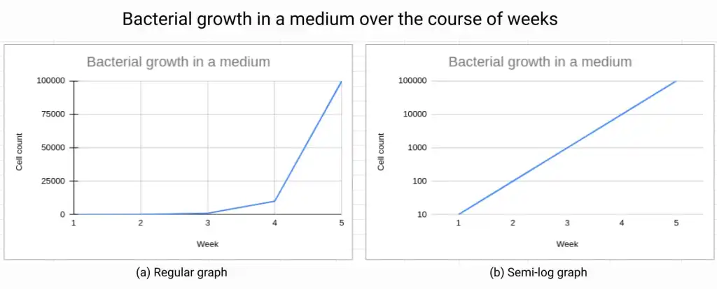
A semi-log plot, also known as a semi-logarithmic plot, is a type of graph that uses a logarithmic scale on one axis and a linear scale on the other axis—kind of like a hybrid between the two if you think about it! This type of plot is useful for displaying data or functions that have a wide range of values, as it allows for a better visual representation of the data.

Source: Amigo Blog
When the y-axis of a semi-log plot is logarithmically scaled, data or functions that demonstrate exponential characteristics will appear linear. This is because the logarithmic scale compresses the large values, making them more visible and easier to compare to smaller values. The linear scale on the x-axis keeps the values on the x-axis in the same proportion, making it easy to compare the slope of the data. 🧍🏽
For example, if you have data that shows an exponential growth over time, it may be difficult to see the overall trend when plotted on a linear scale. However, when plotted on a semi-log plot with a logarithmic scale on the y-axis, the exponential growth will appear as a straight line, making it much easier to see the overall trend and to make comparisons between different sets of data!
Additionally, semi-log plots are useful in fields like biology, chemistry, and physics where data such as bacterial growth, reaction kinetics, and radioactive decay are studied. The semi-log plot is also useful in analyzing electrical circuits where the values of the components vary over multiple orders of magnitude. ⚡
😁 Advantages
An advantage of semi-log plots is that they allow for the detection of exponential growth or decay patterns in data without the need to add a constant to the dependent variable values. This is because the logarithmic scale on the y-axis of a semi-log plot automatically compresses large values, making them more visible and easier to compare to smaller values. 👏
When data that follows an exponential growth or decay pattern is plotted on a linear scale, it can be difficult to detect the underlying trend due to the large range of values. This is especially true when the data has a wide range of values, as small changes in the early stages of the data will not be visible on the same scale as large changes later on. 🙃
However, when the same data is plotted on a semi-log plot with a logarithmic scale on the y-axis, the exponential growth or decay will appear as a straight line, making it much easier to detect the underlying trend. This is because the logarithmic scale compresses the large values, making them more visible and easier to compare to smaller values.
Linearization of Exponential Data****
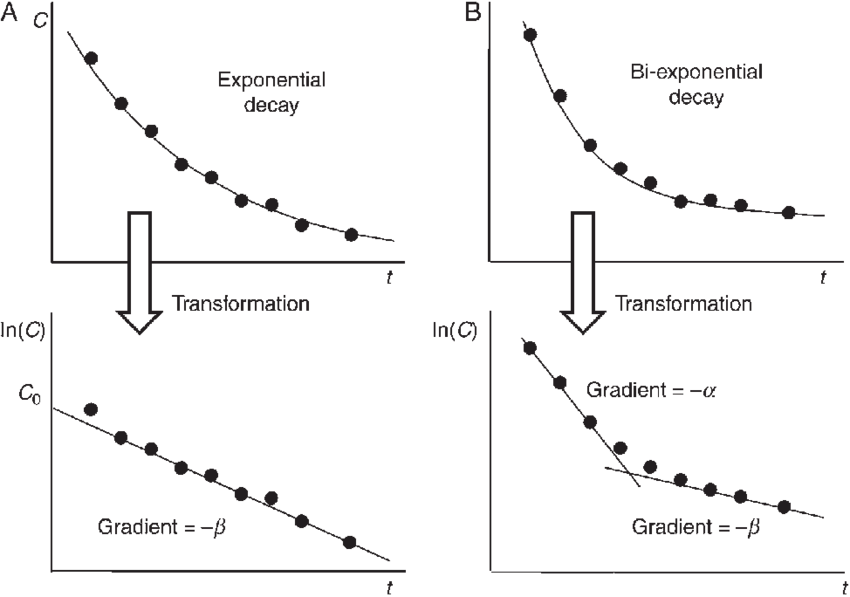
When data that follows an exponential growth or decay pattern is plotted on a semi-log graph with a logarithmic scale on the y-axis, it appears as a straight line. This means that techniques used to model linear functions can be applied to the semi-log graph. 👽
The exponential model of the form y = ab^x can be transformed into a linear model by taking the logarithm of both sides of the equation. Specifically, log_n(y) = log_n(ab^x) . This can be further simplified to log_n(y) = log_n(a) + x log_n(b) .

Source: ResearchGate
The corresponding linear model for the semi-log plot is y = (log_n b)x + log_n(a) , where n > 0 and n ≠ 1. This means that the slope of the line on the semi-log plot is equal to log_n(b) , which represents the rate of growth or decay of the data. The y-intercept of the line is equal to log_n(a), which represents the initial value of the data.
Note that the choice of base for the logarithm (n) is arbitrary, but common choices are base 10 and base e. Also, when using the semi-log plot, the x-axis must be in linear scale. 〰️

© 2024 Fiveable Inc. All rights reserved.